by James Dignan, 21 September 2008

Last modified: 2009-04-24 by marc pasquin
Keywords: movie | film | the life aquatic with steve zissou | team zissou | operation hennessey |
Links: FOTW homepage |
search |
disclaimer and copyright |
write us |
mirrors
The film The life
aquatic with Steve Zissou is a comedy, about a past-his-prime
Jacques Cousteau-like underwater documentary maker, Steve Zissou, and
his team. Part of the plot revolves around competition between Zissou
and his run-down and ramshackle crew and the efficient, rich,
corporate-funded team of his arch rival, Hennessey.
James Dignan, 21 September 2008

by James Dignan, 21 September 2008
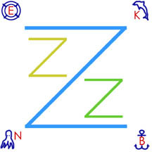
Zissou's flag is simple and shabby - three
coloured Zs attached to a square of white cloth.
James Dignan, 21 September 2008

by James Dignan, 21 September 2008
At a late stage in the movie Zissou's son Ned attempts to "modernise"
the flag of Team Zissou by crudely drawing a lifebelt, a dolphin, an
octopus and an anchor, accompanied by letters: E for Esteban, a
deceased former crewmate, K for Klaus, second-in-command of the
team's boat (the "Belafonte"), N for Ned, and B for the "Belafonte"
itself.
my drawing of the dolphin and octopus were freehand and
pretty poor (then again, so were the originals in the film)
James Dignan, 21 September 2008
The Zissou flag to me
looks the more stylish one (when compared to operation hennessey), and the later additions don't even subtract
all that much from that, even if they are in the wrong shades. It may be
that your drawing skills flatter them, though.
Peter Hans van den Muijzenberg, 21 September 2008

by James Dignan, 21 September 2008
Hennessey's flag, by
comparison to Team Zissou, looks steely and corporate, a bold black and silver H on
a mid-grey background (quite useless for visibility at sea but attractive enough nonetheless).
I have used white to represent silver (the flag
itself had metallic areas).
James Dignan, 21 September 2008
I know I my opinions tend to differ from those of the majority, but to me
the Hennesey flag looks cheap; department-store-y.
Peter Hans van den Muijzenberg, 21 September 2008