image by Ivan Sache, 8 January 2009

Last modified: 2009-08-08 by dov gutterman
Keywords: education |
Links: FOTW homepage |
search |
disclaimer and copyright |
write us |
mirrors
See Also:
Other Institutions:

image by Ivan Sache, 8 January 2009
"Colegio del Santo Įngel" was founded in 1958 in
Bogotį by the Congregation of the Sisters of the Guardian Angel.
Founded in
1839 in Quillan (Languedoc, France) by Father Louis Antoine
Ormičres and Mother Saint Pascal Lavrilloux, the congregation
was recognized by Napoléon III in 1852 and by Pope Leo XIII in
1902. Following the expelling of the religious congregations from
France in the early 20th century, most sisters relocated to
Spain, where they were known as the "French Sisters".
Their first presence in South America was in Venezuela, in 1950.
See also: <catholique-montauban.cef.fr>.
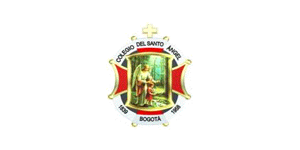
The flag of the institute, as shown graphically and described on
the website
of the institute, is white with the emblem of the institute
in the middle.
White represents purity, liberty and transparency.
The emblem of the institute shows a guardian angel
guiding a child about to cross a bridge over a brook in a forest
landscape. The scene is placed over a red cross bordered in
yellow and surmonted by a yellow Latin cross. The emblem is
inscribed in a white ring bearing the black writings
"COLEGIO DEL SANTO ĮNGEL / 1839 / BOGOTĮ / 1958".
1839 and 1958 are the foundation years of the congregation and of
the institute, respectively. Red and white represent love and
purity.
Ivan Sache, 8 January 2009
Note: this image is incomplete - see below.
image by Carlos Thompson, 28 May 2003
Translated from Universidad Santo Tomįs websites: <www.usta.edu.co>
(Bogotį) and <www.ustabuca.edu.co>
(Bucaramanga, Santander):
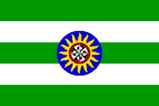
"The flag is composed by five horizontal bands, three in
green and two white alternated, the university shield in the
middle and in the top the national tricolor in triangle".
The pictures do not show the flag completly , so I know I miss
the "national tricolor in triangle", this should mean a
triangle of yellow, blue and red.
Carlos Thompson, 28 May 2003
"Universidad Santo Tomįs", the First Universitary
Convent in Colombia, was founded in Santa Fé de Bogotį by the
Dominican Order on 13 June 1580. Founded in 1608, "Colegio
Santo Tomįs" was subsequently merged with "Universidad
de Estudios Generales" to form "Colegio-Universidad
Santo Tomįs", later renamed "Universidad
Tomįstica".
On 7 March 1965, the Dominican Order's Province of San Luis
Bertrįn de Colombia restored "Universidad Santo Tomįs de
Colombia", which was recognized by the Ministry of National
Education on 6 August 1965 (Decree No. 3645). The university
opened regional seats in Bucaramanga (1973), Boyacį (1996) and
Medellķn (1997).
On the new
symbols' page of the university, the discrepancy reported by Carlos
Thompson has vanished since there is no longer mention of
the national flag in corner.
The shield of the university is a blue disk charged with a black
and white Cross of Calatrava, surrounded by a red ring bearing in
black capital letters the university's name (top) and motto
(bottom), "Facientes Veritatem", in Latin,
"Furthering Truth", and 16 golden rays representing the
"Sun of Aquino", that is the knowledge of St. Thomas of
Aquino.
Ivan Sache, 28 December 2008
"Colegio Santo Tomįs de Aquino", "Dean of the
Colombian Colleges", was founded by the Dominican Order in
Santa Fé de Bogotį in 1573 and refunded in the same town in
1949. It is one of the six colleges ran by the Order, together
with the "Universidad Santo Tomįs", in Colombia
(Province of San Luis Bertrįn of the Order).
The flag of the college,
as shown on a photo and described on the college
website, is horizontally divided yellow-blue-yellow (1:2:1)
with a sun near the fly and (seemingly) the coat of arms of the
college near the hoist.
Blue symbolizes liberty, to be compared with the infinite blue
sky, immense and inexplorable, a free space for the flight of the
birds, the lightning of the constellations and the transit of the
clouds that water the earth.
Yellow represents wisdom, to be compared with incandescence and
light, the golden base of knowledge and the crucible of word
through radiated truth, born from the infinite fire.
The sun is the Sun of Aquino, united with chains, representing
St. Thomas of Aquino's knowledge instilled in all of his
writings. The sun shown on the flag is more complex than the sun
emblem of the college placed in the middle of the crest of the
coat of arms of the college. It has more rays, is plain yellow
and bears a black ring inside (maybe a chain?).
The coat of arms of the
college is made of the Cross of Calatrava countercoloured black
and white, as the specific symbol of the Dominican Order, with a
blue border charged with the yellow writing "VERITAS COLEGIO
STO. TOMAS DE AQUINO", and surmonted by a crenelled crown
charged with a yellow chain and sun, alluded to in the anthem of
the college.
Black, as absorbing light, represents interiorization and
appropriation of knowledge. White, as the lack of colour and the
plenitude of light, represents truth reveealed to mankind and
enlighting it.
The "Identidad Corporativa" booklet of the college,
available as a PDF
file on the website of the college, includes a detailed
construction sheet of the coat of arms, last amended in 2006.
The prescribed shades are:
- Blue: Pantone 2935c / CMYK 100-47-0-0
- Yellow: Pantone 109c / CMYK 0-9-94-0.
Ivan Sache, 2 January 2009

image by Ivan Sache, 3 January 2009
"Colegio Seminario Menor Diocesiano" is a Roman
Catolic institute ran by the Diocese of Chiquinquirį, Department
of Boyacį. The institute was founded by the first Bishop of
Chiquinquirį, His Grace Alberto Giraldo Jaramillo, on 1 November
1978 (Ecclesistic Decree No. 027). Classes started on 20 February
1979 and the institute was recognized by the Ministry of National
Education on 3 March 1982 (Decree No. 2099).
The flag of the institute, as shown on a photo and described on
the
website of the institute, is horizontally divided emerald
green-blue. Green represents the "vegetal velvet covering
the picturesque landscape surrounding the institute", the
green "God's gems" found in the underground of Western
Boyacį (that is, emeralds), and, most important, hope. Blue
symbolizes the Blessed Virgin, the patroness of the institute.
These two colours are also used in the coat of arms of the
institute.
Ivan Sache, 3 January 2009
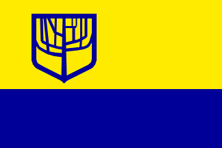
image by Eugene Ipavec, 21 October 2007
The flag of the Universidad Sergio Arboleda. You can find the
explanation of the Coat of Arms at <www.usergioarboleda.edu.co>.
The University is located in Bogota..
Source: Official
website.
E.R., 14 October 2007
The arms are canting; "arboleda' means "grove"
(of trees). The website calls it the "tree of wisdom of
Aristotle," so apparently a diagrammatic representation of
the hierarchy of the sciences rather than an actual tree.
Eugene Ipavec, 14 and 21 October 2007
I have not found yet a reference to Aristotle, but René
Descartes (Les principes de la philosophie, 1644; originally
written in Latin as "Principia philosophiae") defined a
"tree of knowledge". My own translation from the French
text:
"Therefore philosophy is like a tree, whose roots are
metaphysics, trunk is physics and branches emerging from the
trunk are all the other sciences, which can be reduced to three
main ones, medecine, mechanics and ethics, I mean here the
highest and most perfect ethics, which, assuming a perfect
knowledge of the other sciences, is the highest degree of wisdom.
Since fruits are cropped neither from the root or the trunk of
the tree built but only from the end of the branches, the main
usefulness of philosophy depends on its parts which cannot be
learned only as the last one."
The Catalan philosoph and mystic Ramon Llull (XIIIth century)
also uses the metaphor of the "tree of sciences", which
has 18 roots, made of the nine divine (absolute) principles,
including wisdom, and of the nine logical (relative) principles.
Ivan Sache, 21 October 2007
"Universidad Sergio Arboleda", located in Bogotį,
is named after Sergio Arboleda (1822-1888). Born in Popayįn,
Arboleda studied Law at "Universidad del Cauca", where
he was subsequently appointed Rector. Arboleda dedicated most of
his life to the education of the youth but also contributed to
the political life of Colombia, as a member of the National
Congress, of the Assembly of Cundinamarca and of the Provincial
Chamber; he submitted in 1885 a draft of Constitution to the
National Assembly.
The shield of the university was designed by Dr. Alvaro Gómez
Hurtado, in collaboration with Dr. Ramón Bulla Qunitina, Dean of
the School of Philosophy, Humanities and Education.
The trunk of the tree represents Philosophy. The branches on the
right side of the trunk are Humanities, such as Literature,
Philosophy, Astronomy, Law, Communication...
The branches on the left side of the trunk are Exact Sciences,
such as Mathematics, Finance, Engineering, Economy... The border
of the shield encompasses all knowledge, with the following
caveat emptor: "If first we don't understand God's love, all
knowledge will be difficult, obscure and unuseful".
Source: <www.usergioarboleda.edu.co>.
Ivan Sache, 28 December 2008

image by Ivan Sache, 29 January 2009
"Institución Educativa 'Silvino
Rodrķguez'" was founded in the Municipality of
Tunja, Department of Boyacį, in 1973 (Decree No. 12), through
the merging of "Colegio 'Silvino
Rodrķguez'" and "Liceo Departamental Femenino",
founded on 31 August 1963 (Decree No. 726) and in 1964 (Decree
No. 039), respectively.
The institute is named after Silvino Rodrķguez, Governor of
Boyacį in the 1920s.
The flag of the institute, as shown graphically and described on
the website
of the institute, is horizontally divided
yellow-green-yellow, the two colours being also used on the
emblem of the institute.
The flag and emblem were designed by Otoniel Jiménez Cuervo and
Alfonso Marińo Camargo. Yellow represents the projection of the
young minds, looking like sun rays, eager to learn and know.
Green represents hope.
Ivan Sache, 29 January 2009

image by Ivan Sache, 29 December 2008
"Universidad Simón Bolķvar" was founded on 15
October 1972 in Barranquilla by the economist José Consuegra
Higgins (b. 1926), former Rector of "Universidad del
Atlįntico".
The flag of the university, as shown graphically and described on
the university
website, is white with the green emblem of the university.
The emblem of the university is made of a big letter
"U" and the signature of Simón Bolķvar. Green
represents the Bolivarian ideal and the fertility of the fields.
The text seems to indicate that the signature is taken from the
"Carta de Jamaica" ("Letter from
Jamaica") written by the Liberator on 6 September
1815, mostly calling for the union of the countries of the
Americas (see the original text in Spanish at <ww.simon-bolivar.org>).
Ivan Sache, 29 December 2008
I happen to have this text in English but it does not mention
flags I believe. (Fitzgerald, Gerald E. 1971. The Political
Thought of Bolivar. The Hague: Martinus Nijhoff.).
Jan Mertens, 29 December 2008
"Universidad del Sinś 'Elķas Bechara Zainśm'
" (a.k.a UniSinś) was founded in 1974 in
Monterķa by Dr. Elķas Bechara Zainśm. Born in 1920, Bechara
studied chemistry; he founded in 1962 the "Instituto
Agricola de Lorica" and in 1964 the first university in the
region, the "Universidad Nacional de Cordóba". In
1974, he founded the "Corporación Educativa Superior de
Cordóba", renamed in 1980 "Corporación Educativa
Superior del Sinś".
The university has today two campuses, in Monterķa (Faculties of
Law; Health Sciences; Odontology; Social, Human and Education
Sciences; Economic and Accounting Sciences; Architecture Science
and Engineering) and Cartagena (founded in 1998).
The flag of the university is shown graphically and described on
the university's
website. It is horizontally divided in white and red stripes,
whose number is not clear on the graphic (probably five stripes
starting with a white stripe on top).
Red represents strength and power while white represents peace
and tranquilllity.
Ivan Sache, 16 December 2008
Current flag
image by Ivan Sache, 13 January 2009

Former flag (until 1993)
image by Ivan Sache, 13 January 2009
"Colegio Universitario Socorro" was founded in
Socorro, Department of Santander, on 15 January 1826, as
"Colegio del Socorro", succeeding a primary school
originally founded in 1778. The institute was elevated a
"Colegio Universitario" in 1823. The Department of
Santander merged in 2002 (Decrees No. 12501, 28 October, and No.
13488, 18 November) "Colegio Universitario Socorro"
with "Concentración Escolar Kennedy",
"Concentración Escolar Bicentenario", "Instituto
Cooperativo Cacique Chanchón" and "Concentración
Escolar Comuneros".
The flag of the institute is shown graphically and described on
the website of the institute.
Deploring that the institute had the same flag as most other
educational institutes of Socorro and the national police, the
Arts professors Luis Eduardo Manrique Corzo and Alirio Gómez
Gómez proposed in 1993 to change the flag of the institute,
while keeping its traditional colours, white and green. The board
of the institute agreed and organized a flag competition, whose
winners were the students Leady Selenet Archila and Adriana Maria
Estévez Gerena, from the "7B" class.
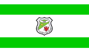
The flag is 2.50 m x 1.75 m (proportions 7:10), horizontally
divided white-emerald green-white-emerald green-white
(3:7:15:7:3) with the emblem of the institute in the middle.
White represents purity, virtue and transparency. Green
represents hope in a better future.
The designer of the emblem, used for 50 years, is unknown. The
shield is "Per bend sinister vert a mullet or argent an
eagle gules", with a white scroll charged with
"CUS" sable over the chief, and "SIC ITUR AD
ASTRA" sable in the border of the shield.
Green represents hope and the agronomical resources of the
region.
The yellow star represents the light enlightening and guiding the
students and educators on the right way. "CUS" is the
acronym of "Colegio Universitario Socorro".
White represents purity, clarity, sensibility, virtue and noble
aspirations.
The red eagle spreading wings to fly represents greatness, visual
acuity, liberty, courage, strength and value required to get rid
of the obstacles.
The Latin motto "SIC ITUR AD ASTRA" means "Thus
you shall go to the stars". The original source is in
Virgil's Aeneid (IX, 641), Apollo exhorting young Ascanius:
"Macte, nova virtute, puer, sic itur ad astra"
("Courage, child, thus you shall go to the stars").
Ivan Sache, 13 January 2009
ITSA ("Instituto Tecnólogico de Soledad
Atlįntico"), based in Soledad, was recognized by Law 391 on
23 July 1997. The flag of
ITSA is shown graphically and described on the ITSA website. The flag is
horizontally divided blue-yellow-blue with the logo of ITSA in
the middle.
The logo of ITSA is composed of a series of elements graphically
symbolizing the most significant features of the origin of ITSA
and of its institutional mission.
The cogwheel symbolizes industrialization and was inspired by a
similar element from the logo of ITIDA (Instituto Técnico
Industrial del Atlįntico), the institute where the creation of
ITSA was decided. The green disk in the middle corresponds to the
universal projection of ITSA. The typography used for
"ITSA" reflects solidity and seriousness, increased
with elements representative of the study areas of the institute.
The name of the institute in a semi-circular pattern stands on an
open book yellow and blue, representing education as the source
of knowledge.
Ivan Sache, 19 December 2008

image by Ivan Sache, 28 March 2009
"Escuela Normal Superior 'Sor Josefa Del Castillo y
Guevara' " was founded in the 1950s at Chiquinquirį,
Department of Boyacį. The institute is named after Venerable
Mother Josefa Del Castillo y Guevara (1671-1742), called
"St. Teresa of America"; her works, eventually
published in 1968, include her autobiography ("Mi
vida" / "My Life") and a mystic treatise
("Afectos espirituales" / "Spiritual
Affections").
The flag of the institute, as shown graphically and described on
the institute's
website, is horizontally divided green-
white-"carmelite" ("carmelito").
"Carmelite" must be here the brown colour of the
Carmelite mantle.
Green represents hope.
White represents purity.
"Carmelite" represents the union of souls with duty,
the commitment of the life to the service of mankind in its most
noble way, education.
Ivan Sache, 28 March 2009

image by Ivan Sache, 16 December 2008
"Colegio Stella Matutina" (in Latin, "Morning
Star", a personification of the Blessed Virgin invoked in
the "Litany of the Blessed Virgin Mary" /
"Litaniae lauretanae") was inaugurated in 1962 by the
Congregation of the Sisters of Bethany ("Congregación
Hermanas de Bethania"). Founded by two nuns, Dolores de
Marķa Zea and Marķa de la Cruz Pinto, born in Guatemala and
Salvador, respectively, the congregation was canonically approved
on 20 January 1928 by His Grace José Alfonso Belloso y Sįnchez,
Bishop of San Salvador, on behalf of Pope Pius XI.
The flag of the institute is horizontally divided blue-green,
meaning "from the Earth to Heavens" and symbolizing the
hope in heavens. The flag is hoisted, together with the national
flag of Colombia, in front of the institute.
Source: <www.stellamatutina.edu.co>.
Ivan Sache, 16 December 2008

current flag
image by Ivan Sache, 28 March 2009

former flag
image by Ivan Sache, 28 March 2009
"Colegio de Sugamuxi" (COLSUGA) was founded on 12
October 1905 by Dr. Joselyn Parada Leal at sogamoso, the capital
of the Province of Sugamuxi, Department of Boyacį. By Decree No.
17 of the Departmental Assembly, the institute became in 1937 a
Departmental School, whose named was changed in 1939 to
"Academia Militar del Sugamuxi" or "Colegio del
Sugamuxi, Academia Militar". Renamed in 1975 "Colegio
Nacional de Sugamuxi", the institute has always been known
under its historical name, "Colegio de Sugamuxi", even
if its current legal name is "Institución Educativa
Sugamuxi".
The flag of COLSUGA, as described on the institute's
website, is horizontally divided olive greenish
("aceitunado")-white with a yellow-orange
("amarillo-naranja") triangle placed along the hoist.
The triangle was added in 1985 to the former flag, horizontally
divided olive greenish-white, whose adoption date is unknown, to
distinguish the flag of the institute from the flag of other
public and private bodies. Exact proportions and shades not
known.
Ivan Sache, 28 March 2009

image by Ivan Sache, 29 January 2009
"Institución Educativa Rural del Sur" (of the
South) was founded in the Municipality of Tunja, Department of
Boyacį, on 20 September 2002 (Decree No. 02424).
The flag of the institute, as shown graphically and described on
the
website of the institute, is horizontally divided
yellow-green-white- green-yellow (1:1:2:1:1) with six yellow
stars in the middle. Yellow represents wisdom, maturity, wealth
and generosity, and, on the flag, an allegory of the rural
resources in the municipal context and of the common interests
shared by the whole community. Green represents the agricultural
productivity but also aspirations to a better future supported by
science, technology and technique, expected to provide a better
standard of life to the inhabitants. White represents peace,
balance and sustainable development. The stars are symbols of
light, strength, knowledge and victory, each representing a seat
of the institute and their institutional interactions.
On the emblem of the institute, designed by Dr. Carlos Cuervo
Escobar, the second quarter is yellow with the flag of Tunja
(horizontally divided green-white-green, probably a source for
the flag of the institute) and the flag of the institute crossed
per saltire.
Ivan Sache, 29 January 2009