
image by Ivan Sache, 29 January 2009

Last modified: 2010-02-19 by dov gutterman
Keywords: education |
Links: FOTW homepage |
search |
disclaimer and copyright |
write us |
mirrors
See Also:
Other Institutions:

image by Ivan Sache, 29 January 2009
"Institución Educativa Departamental Rural La
Balsa" was founded in the village of La Balsa, Municipality
of Chķa, Department of Cundinamarca, on 23 December 2003 (Decree
No. 5741), succeeding "Colegio Bįsico La Balsa"
recognized on 18 September 1997 (Decree no. 1437).
The symbols of the institute are prescribed by Decree No. 002 of
the Board of Directors of the institute, issued in 2005, and
available on the website
of the institute. The flag and arms were selected in a
students' competition, while the anthem was composed by the
Director of the institute. The flag and arms were designed after
the winning proposals made by Jamaica Sarmiento Wilmer Alejandro
and Sierra Casallas Luis Alejandro. The flag is horizontally
divided light blue-white-dark blue. Light blue represents
loyalty, confidence, wisdom, faith, truth and eternal heavens.
White represents light, kindness, purity, perfection and peace.
Dark blue represents knowledge, integrity, seriousness and power.
The same colours are used in the shield, on which the light and
dark blue field are separated by a thin white ascending diagonal
stripe.
Ivan Sache, 29 January 2009

image by Ivan Sache, 2 February 2009
"Institución Educativa La Campińa" was founded in
1976 by Oswaldo Espitia in the village of La Campińa (founded in
1973), Municipality of Yopal, Department of Casanare.
The flag of the institute, as shown graphically and described on
the website of the
institute, is divided blue-yellow according to the ascending
diagonal and charged with a three-rayed orange sun placed along
the hoist.
Blue represents the education and the values provided in the
institute, constance and investigating spirit.
Yellow represents the light guiding the students to fulfill the
motto of the institute, "Ciencia y Libertad" (Science
and Liberty), and transform their social status.
The three rays of the sun represent the three levels of education
provided by the institute, pre-school, basic and median.
Ivan Sache, 2 February 2009

image by Ivan Sache, 9 June 2001
Colegio Lacordaire (Cali) - 2:3 flag, horizontally divided
black-white-yellow. <www.lacordaire.edu.co>,
located by Dov Gutterman, gives a detailed explanation
of the colour symbolics (in Spanish): Black and white are colours
specific to the Dominican Order. Yellow is specific to the
Collegio Lacordaire. Black is the colour of penitence and
mortification, necessary to reach triumph and perfection, black
absorbs light as well as prayer, study and communitiy life absorb
truth. White is the colour of purity, joy, truth etc. and
constitutes the invisible armour that shall protect the young
students from error and evil. Yellow is the colour of light and
spiritual wealth etc.
More information from 'Petit Larousse Illustre': The Dominican
Order (also called Order of Preaching Friars) was founded in 1215
by St. Dominic, a Castilan monk (c.1170-1221, canonized in 1234)
and confirmed by Pope Honorius III in 1216. The Order was founded
to fight the Cathar heresy, and its rule was a community
democratic life totally devoted to predication of God's World.
Henri Lacordaire (1802-1861) was a French priest who took the
Dominican cloth in 1827 and restored the Order in France in 1830.
He was elected deputy in Marseilles in 1848 and founded the
Christian-Democrat review 'L'Ere Nouvelle' ('The New Era'),
Because of the political troubles of May-June 1848, he abandoned
politics and journalism and devoted the rest of his life to the
restoration of the Dominican Order, establishing several schools
and colleges.
Ivan Sache, 9 June 2001

image by Eugene Ipavec, 17 February 2007
Universidad de La Costa - (University of the Coast) is the
commonly used name for the Corporación Universitaria de La Costa
(University Corporation of the Coast). The university is located
in the city of Barranquilla, and the university flag can be seen
at <www.cuc.edu.co>
Ron Lahav, 13 February 2007

image by Ivan Sache, 6 January 2009
"Colegio Campestre La Estrella" (CICE) is located in
the municipality of Itagüķ.
The flag of CICE, as shown graphically on the website
of the institute, is horizontally divided green-yellow-blue
Green represents the natural environment, which is the support of
a field institute.
Yellow represents light, spiritual resources and power.
Blue represents virtue, respect and honesty under the Colombian
sky.
Ivan Sache, 6 January 2009

image by Ivan Sache, 29 March 2009
"Gimnasio La Fragua" (lit., "The Forge")
was founded in 1984 at Neķva, Department of Huila, by ASPAEN
("Asociación para la Enseńenza), the organization set up
in Colombia by the Opus Dei movement.
The flag of the institute, as shown graphically and on a photo
and described
on the website of the institute, is horizontally divided into six
yellow end green stripes, with a white triangle placed near the
hoist and charged with the "GF" monogram of the
institute surmonted by four yellow stars.
Green represents the strength and faith in the future of the
educational community, as well as its contribution to educational
science and technology and to the protection of the environment.
Yellow represents light, life and divine energy.
White represents positive energy, transparency, beauty and
honesty.
The four yellow stars are the highest aspirations of the
institute, its mission and vision, its human principles and
values, its objectives, its efficiency and educational quality.
The monogram is made of the letters "G" and
"F", interlaced to represent fraternity and solidarity.
Ivan Sache, 29 March 2009
"Collegio La Inmaculada" was founded in 1967 by
Mother Marķa Pilar Izquierdo Albero in Chia.
The flag of the institute, as shown on a photo available on the institute's
website, is horizontally divided white-light blue with the
emblem of the institute in the middle. White and light blue are
the traditional Marian colours.
The emblem of the institute is an open book placed behind a
torch. The left side of the book is white with the name of the
institute in dark blue; the right side of the book is dark blue
(much darker than the flag field) with a white flower sumronted
by the motto of the institute, in dark blue letters, "Amor /
Ciencia / Virtud" (Love / Science / Virtue).
Ivan Sache, 15 December 2008

image by Ivan Sache, 5 February 2009
This College was founded in 1915. Its flag is horizontally
divided white-red.
Source: <www.voluntad.com.co>
(defunct), located by Dov Gutterman.
Ivan Sache, 4 January 2004
"Colegio La Merced" , located at Bucaramanga,
Department of Santander, is ran by the Tertiary Capuchin Sisters
of the Holy Family (known in the Hispanic world as
"Amigonianas"). The congregation was founded on 27
April 1885 by Luis José Marķa Amigó y Ferrer (1854-1934),
appointed Bishop of Segorbe (Spain) in 1913, and also the founder
of the Tertiary Capuchin Priests and Brothers of Our Lady of
Sorrows ("Amigonianos") on 12 April 1889. See: <bishopamigo.org>.
The flag of the institute, according to a photo and the
description available on the website of
the institute, is horizontally divided white-red.
White symbolizes purity and peace.
Red symbolizes love.
Ivan Sache, 5 February 2009

image by Ivan Sache, 7 February 2009
"Escuela Normal Superior La Merced" was founded on 1
February 1913 in Yarumal, Department of Antioquia, by the
Tertiary Capuchin Sisters of the Holy Family (known in the
Hispanic world as "Amigonianas"). The congregation was
founded on 27 April 1885 by Luis José Marķa Amigó y Ferrer
(1854-1934), appointed Bishop of Segorbe (Spain) in 1913, and
also the founder of the Tertiary Capuchin Priests and Brothers of
Our Lady of Sorrows ("Amigonianos") on 12 April 1889.
The third house of the congregation in Colombia was set up in
Yaruma in 1912. See: <bishopamigo.org>.
The flag of the institute, as shown graphically and described on
the website
of the institute, is horizontally divided white-blue.
White represents purity, integrity, obedience and victory.
Blue represents justice, heavens, truth, charity, inner beauty
and reward.
Ivan Sache, 7 February 2009
"Colegio Nacionalizado La Presentación" is located
at Duitama, Department of Boyacį.
Photos available on the website
of the institute show two different versions of the flag.
On photos
taken during the Colours ceremony 2008, the flag is horizontally
divided blue-white with the emblem of the institute in the
middle.
On photos
taken during the "Intercolegiados" sports event, 17
July 2008, the flag is horizontally divided white-blue with the
emblem of the institute in the middle.
To make the things even simplier, the flag used during the Colours
ceremony at the Higueras section of the institute seems to be
horizontally divided white-blue, without the emblem (but the
emblem on the other flags is quite small, therefore it may have
remained hidden in the flag folds).
The emblem of the institute shows, on a white disk bordered by a
blue ring with the name of the institute in white capital
letters, a blue disk outlined in yellow, charged with a yellow
bee in the middle and ten yellow disks on the border, and
surmonted by a yellow cross.
Ivan Sache, 14 January 2004
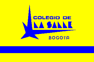
image by Carlos Thompson, 17 March 2003
Colegio de La Salle, Bogotį, Colombia (La Salle School, Bogota) - This is my school, so I know how
the flag looked like, and I checked with a black and white
picture. A yellow field with a blue band bellow, in the
middle there is the Star of the school (every La Salle
institution has its own star), with the words COLEGIO DE LA SALLE
above the star and BOGOTA bellow.
Carlos Thompson, 17 March 2003
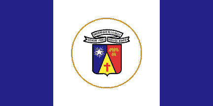
image by Carlos Thompson, 17 March 2003
Universidad de La Salle, Bogota,
Colombia (University of La Salle) - According to <www.lasalle.edu.co>,
the picture show a blue-white-blue, equally divided vertically
flag, but in the text they say that the white is wider and the
coat of arms is in the middle enclosed by a golden circle.
Carlos Thompson, 17 March 2003
The flag is one of the most representative symbols of the
university, used in main ceremonies, the Day of St. Jean-Baptiste
de La Salle (15 May), graduation ceremonies, special ceremonies.
The graduates of the university shall take the oath on the flag.
The flag shall be half-staffed after the death of students,
professors or administrators of the university, and may cover
their coffin.
Blue represents the sky that covers us, water that feeds us and
freedom, the source of democracy.
White represents the light that enlightens and guides us, ethics,
honesty, dignity and purity in the intentions.
The shield placed in the middle of the flag represents the
"Signum Fidei" (Sing of Faith) of the Institute of the
Brothers of the Christian School (aka De La Salle Brothers).
The shield of the university reflects its origin, philosophy and
project for the future. The shield is of modern shape,
symbolizing the institute as a modern community.
The honour (central) piece of the shield, a pile or issuing from
the base, symbolizes rectitude and honesty that should guide all
the acts of the university, as well as the exemplary
honourability of its governors and the commitment to help the
poor and defend the principle of authority. It is charged with a
cross gules, shaped like the cross used by the knight crusaders,
as a symbol of Christian and Catholic faith and of a new crusade
for culture, science and technology led by the university.
The dexter (left) piece, azure, symbolizes serenity and balance.
It is charged with the Lasallian star argent with projections or,
which is the universal symbol of the Lasallian movement.
The sinister (right) piece, gules, symbolizes intrepidity,
heroism and sacrifice. It is charged with three broken chevrons
or taken from the arms of the De La Salle family.
The scroll placed above the shield bears in capital letters
sable, as a symbol of science and knowledge, the name of the
university, the motto of the De La Salle Brothers ("Signum
Fidei", in Latin, "Sign of Faith") and the motto
of the De La Salle family ("Indivisa Manent", in Latin,
"Let us all be united").
The Lasallian star recalls the legend saying that a star fell
from the sky to mark the place where an abbey dedicated to the
Blessed Virgin (here, Our Lady of the Star) should be built. It
also symbolizes the Lasallian teachings guiding the youth.
Another Lasallian
website recalls the history and heraldry of the De La Salle
family as follows:
"The house of De La Salle was first established in Urgel, an
area of Catalonia, Spain, where the form of the family name was
"Salla." The head of the family, Johan Salla, Warrior
in Chief of Atphonus the Chaste, King of Oviedo, expelled the
Moors from Urgel and reestablished the Episcopal See in 818. The
broken legs he sustained during combat as he fought side by side
with his king are the origin of the broken chevrons on the De La
Salle's coat of arms.
In the 13th century, the family migrated to the Basque County in
the south of France, and though their name became French, they
retained "Salla!" as their battle cry. The ancient
motto of the family is "Que sien toustem ligato
amasse," which in Gascon language means "Let us all be
united!" or "Let us all stick together!" The Reims
branch of the family translated this motto into the Latin
"Indivisa Manent," which is the present wording of the
motto on the coat of arms."
Ivan Sache, 27 December 2008
"Corporación Universitaria Lasallista", located in
Caldas, was approved by the Ministry of National Education on 22
June 1983 (Decree No. 9887).
Classes started on 6 February 1984 in Medellķn.
The flag of the
university, as shown graphically on the university
website, is dark blue with the yellow logo of the university
in the middle.
The logo shows the star of faith derived from the coat of arms of
the Institute of the Brothers of the Christian School, above the
letters "UL", standing for "Universitaria"
and "Lasallista", respectively.
Ivan Sache, 17 December 2008

image by Eugene Ipavec, 18 February 2007
The Universidad Autónoma Latinoamericana (Latin American
Autonomous University) is located in Medellķn,
The university flag can be seen at <www.unaula.edu.co>.
Description of the Flag: "Conceived by attorney Ramón
Emilio Arcila Hurtado; approved simoultaneously with arms.
Consists of two stripes of equal size: the first, (top) red one
symbollizes the University's fight and sacrifice to rejects
tradition and embrace progress. The second, (lower) mustard one
represents a lively and glowing university, with a diversity of
ideologies and creeds"
Ron Lahav and Eugene Ipavec, 18 February 2007

image by Ivan Sache, 28 January 2009
"Colegio La Toscana" is located in the borough of La
Toscana, ward of Suba, in the north-westernmost part of Bogotį.
Classes started on 19 April 1996.
The flag of the institute, as described on the website of the
institute, is horizontally divided white-dark red (lit.
"red wine"). The flag was adopted after a students'
competition.
Ivan Sache, 28 January 2009

image by Ivan Sache, 27 February 2006
Colegio La Trinidad (Institución Educativa Rural La Trinidad)
is located in the village of La Trinidad, Municipality
of Manizales, Department of Caldas. The flag of the Colegio is
horizontally divided yellow-white. Yellow represents work, effort
and commitment, whereas white represents purity. Yellow (border)
and white (field) are also the colours of the shield of the
Colegio.
Source: <www.comunidad.com.co>,
located by Valentin Poposki.
Ivan Sache, 27 February 2006

image by Ivan Sache, 31 January 2009
"Institución Educativa 'Libertador Simón
Bolķvar'" was founded on 30 September 2002 in the borough
of Bolķvar, Municipality of Tunja, Department of Boyacį (Decree
No. 2419), through the merging of "Colegio de Educación
Bįsica Simón Bolķvar", "Colegio de Educación
Bįsica Los Libertadores" and "Concentración Escolar
del Sur".
The flag of the institute, as shown graphically and described on
the website of
the institute, is horizontally blue-white-green.
Blue symbolizes the heavens and the horizon shared by all.
White symbolizes purity and transparency.
Green symbolizes hope, the fields and the local landscape.
Ivan Sache, 31 January 2009

after photos on the main
website, with "Bogota" on the
emblem
image by Ivan Sache, 28 December 2008
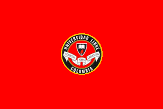
after the Cali
website, without "Bogota" on the
emblem
image by Ivan Sache, 28 December 2008
Image at <www.ulibrepei.edu.co>.
Dov Gutterman, 21 July 2002
According to the picture at <www.ulibrepei.edu.co>,
the seal seems smaller and towards the hoist. The description
says however that the seal is in the center.
Carlos Thompson, 17 March 2003
"Universidad Libre" succeeded on 13 April 1912
"Universidad Republicana", founded in Bogotį at the
end of the 19th century by Liberal and Masonic intellectuals.
Lacking funds, the university could not start classes until 13
February 1923, with the help of General Benjamin Herrera,
unsuccesfull candidate at the presidential election in 1921.
The university has its main seat in Bogotį and regional seats in
Baranquilla, Cali, Cartagena, Cścuta, Pereira and Socorro.
The flag of the university, as shown on different websites of the
university, is red with the university emblem in the middle. Red
represents the academic dignity, action and permanent revolution
for freedom.
The emblem of the university is made of a red disk charged with
the shield of the university, black with a white open book
surmonting a red Phrygian cap, and a white scroll bearing the
motto of the university, "Sciencia Fons Libertatis", in
Latin, "Science source of freedom", in black letters.
The disk is surrounded by a black ring outlined in gold an
charged with the name of the university in white capital letters.
Symbols' page on the university main website is at <www.unilibre.edu.co>.
Symbols' page on the Cali seat website is at <www.unilibrecali.edu.co>.
Symbols' page on the Cścuta website is at <www.unilibrecucuta.edu.co>.
Symbols' page on the Pereira website is at <www.unilibrepereira.edu.co>.
The best view on the flag has to be found on the Cali website.
There are a number of variations in the representation of the
emblem in these images.
Ivan Sache, 28 December 2008

image by Ivan Sache, 10 January 2004
The College was founded in Valle del Lily in 1974. Its flag is
blue with a pink diamond in the middle, touching the upper and
lower borders of the flag and flanked by two smaller green
diamons touching the left and right borders of the flag,
respectively. A blck logo made of a combination of the G and F
letters is placed in the pink diamond
Source: <www.voluntad.com.co>,
located by Dov Gutterman.
Ivan Sache, 10 January 2004
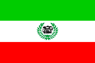
image by Ivan Sache, 14 Febuary 2004
The 'Fundacion Universitaria Los Libertadores' was founded in
Bogota in 1982. Its flag is horizontally divided green-white-red
with the emblem of the Institute in the middle of the white
stripe. The emblem is made of the heads of the three
'Libertadores', who are: 'El Libertador', Simon Bolivar; 'El
Hombre de las Leyas', Francisco de Paula Santander; 'El Precurso
de la Independencia', Antonio Narino. The heads are surrounded by
a laurel wreath.
Source: <www.ulibertadores.edu.co>,
located by Dov Gutterman.
Ivan Sache, 14 Febuary 2004
A photo of the flag of the university is shown on this page.
Green represents esperance, honour and friendship.
White represents integrity, purity, and eloquence.
Red represents fire, highness, value and strength.
The heads of the three Libertadores are surrounded by 42 leaves
of laurel.
Ivan Sache, 17 December 2008
"Colegio 'Los Periodistas'" was founded in 1992 in
Bogotį.
The flag of the institute, as described on the website of the
institute, is "white and blue with the emblem of the
institute in the middle".
The emblem of the institute is a shield divided per bend sinister
white-blue, with overall a white parchment outlined in blue and
charged with the blue letters (seemingly) "CL", the
interlaced "C" and "L" also forming a
"P", and a blue border charged with the name of the
institute in white letters, "INSITITUCION" (left),
"EDUCATIVA" (bottom), "DISTRITAL" (right),
and "LOS PERIODISTAS" (top).
Ivan Sache, 17 January 2009

image by Ivan Sache, 7 January 2009
"Colegio Luis Carlos Gįlan Sarmiento" is located at
Inķrida, Department of Guainķa.
The institute is named after Luis Carlos Gįlan Sarmiento
(1943-1989), a Colombian journalist and liberal politician,
murdered by hitmen, probably hired by the drug cartels, during a
demonstration in Soacha, Department of Cundinamarca.
The flag of the institute, as shown graphically and described on
the website
of the Secretary of Education of the Department of Guainķa, is
white cross.quartered red-blue by a white cross.
Ivan Sache, 7 January 2009
image by Ivan Sache, 31 December 2009
"Colegio 'Luis Carlos Gįlan Sarmiento'" is based at
Girón, Department of Santander.
The institute is named after Luis Carlos Gįlan Sarmiento
(1943-1989), a Colombian journalist and liberal politician,
murdered by hitmen, probably hired by the drug cartels, during a
demonstration in Soacha, Department of Cundinamarca.
The flag of the institute, as shown graphically and described on
the website of the institute (after the "Pacto de
Convivencia" of the institute), is horizontally divided
red-white-green with the emblem of the institute in the middle.
Red represents energy and the power of the ideas defended by the
institute. White represents transparency and integrity of the
members of the educational community. Green represents the
highness of the mountains and the pride and frankness of the
community.
The emblem of the institute is made of the four interlaced
capital letters "C" ("Colegio"), L
("Luis"), "C" ("Carlos") and
"G" ("Gįlan"), all outlined in blue [in
black on the drawings], placed above a semi- circular scroll
charged with "COLEGIO LUIS CARLOS GALAN SARMIENTO" in
red letters [on the drawings, COLEGIO LUIS CARLOS G. in black
letters]. The emblem is inscribed in a virtual triangle whose
vertical altitude is made of an L-shaped arrow pointing to the
infinite, symbolizing universality. Below the emblem is the name
"GIRON", the seat of the institute and a component of
the national historical and cultural heritage. Blue represents
the perdurability of ideas as well as the transcendancy and
highness of the inhabitants of Santander; the red letters
symbolize the fieriness of their speech and the strength of their
convictions [on the drawings, the writing is white on a red
background].
The four letters also represent four words:
- The first "C", for "Compromiso"
(Compromise), representing the pact between our great leader and
the Colombian people, fervently supported by our community;
- "L", for "Libertad" (Liberty), defended by
our charismatic policy and expressed both in teaching and
training;
- The second "C", for "Calidad" (Quality),
provided by the institute to the local youth;
- "G", for "Grandeza" (Greatness), expressed
by our director and a characteristic of all members of the
institute. The interlacing of the letters symbolizes union and
solidarity among the different members of the educational
community.
Source: <lcgssedec.wordpress.com>
Ivan Sache, 31 December 2009