
Last modified: 2009-08-08 by dov gutterman
Keywords: education |
Links: FOTW homepage |
search |
disclaimer and copyright |
write us |
mirrors
See Also:
Other Institutions:
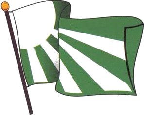
"Escuela Normal Superior de Ibagué" was founded in
1910 in Ibagué, Department of Tolima.
The flag of the institute,
as shown graphically and described on the website
of the institute, is green with a white quarter-of-sun in
canton and four white rays reaching the edges of the flag. The
tradition says that green and white are the colours of the
institute, but these colours were never used on a flag until a
competition was launched in 1999. The Governing Council of the
institute approved the proposal submitted by teacher Gerardo
Erasmo Vivas Paz as:
"A sun of white light emits its rays on a green background.
White is a symbol of purity and knowledge, while green is a
symbol of hope and youth. The four rays represent the four levels
of education offerred by the institute; pre-school, basic, median
and complementary cycle. [...]"
Ivan Sache, 2 February 2009

image by Ivan Sache, 25 December 2002
ICESI was founded in 1979 by a group of business leaders from
the Department of Valle. It is located
in the area of Pance, a suburb in the south of Cali. The flag is
horizontally divided blue-white-green (1:2:1) with the emblem of
the University placed in the midle of the white stripe. The
official size of the flag is 1.10 x 1.80 m (approx. 3.5 x 5.8
ft). The emblem of ICESI is made of a blue rosette with letters L
placed concentrically around the circumference, UNIVERSIDAD in
green capital letters and ICESI in blue capital letters, both
being placed right to the rosette, and a green line under all
items, which symbolizes unity.
Source: <www.icesi.edu.co>,
located by Dov Gutterman
Ivan Sache, 25 December 2002
construction sheet
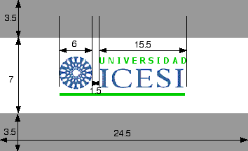
image by Ivan Sache, 30 December 2008
There is a construction sheet for the flag provided on this
page, but I cannot figure out how it can work. Dimensions are
given in the text as 1.80 m x 1.10 m (18/11 ~ 1.64) but the
construction sheet gives 24.5 x 14 (7/4 = 1.75). Moerover, the
figures given for the horizontal dimensions are not on the same
scale as those given for the vertical dimensions (compare 6x and
7x).
Ivan Sache, 30 December 2008
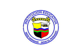
image by Ivan Sache, 3 February 2009
"Institución Educativa Infantas", with two seats at
Miramar and El Parnaso, Municipality of Barrancabermeja,
Department of Santander, is the follower of the first
school founded in the oil district by the "Tropical Oil
Company" in 1932. The institute is ran by the Industrial
University of Santander.
The flag of the institute, according to a photo and the
description available on the website of the
institute, is white with the emblem of the institute in the
middle. White stands for peace.
The shield of the institute is of "mixed Swiss and Spanish
shape". It is quartered, horizontally by three wavy stripes
blue-red-green, and vertically by a thin black line. The upper
left quarter, or, representing the gold resource, has to be
understood jointly with the lower left quarter, sable, the
"black gold" being here oil; Barrancabermeja is known
as "The Oil Capital of Colombia". The upper right
quarter is argent, symboizing the values of the institute, with a
charge unfortunately not described. The lower right quarter is
gules, symbolizing life, joy, dynamism, strngth, energy and
tenacity. The wavy fess vert represents the seat of El Parnaso,
named after the Greek Mount Parnassus, where God Apollo lived
among the Muses. The wavy fess azure represents the seat of
Miramar, surrounded by swamps. The wavy fess gules is not
mentioned in the description.
The shield is surmonted by a yellow scroll ending with four
upwards points, a symbol of courage, charged with
"INFANTAS" in black letters. Here again, the yellow and
black colours recall oil.
The shield and scroll are inscribed in a white disk surrounded by
a white ring outlined in blue and charged with "INSTITUCION
EDUCATIVA" (top) / "SEDE MIRAMAR SEDE EL PARNASO"
(bottom) in blue letters.
Ivan Sache, 3 February 2009

image by Ivan Sache, 1 February 2009
"Instituto INGABO" was founded in 1996 in
Restrepo,Department of Meta, with a second seat at Chapinero,
Bogotá. Classes are given in public health and business
management.
The flag of INGABO, as shown graphically on the website of the
institute, is horizontally divided green-yellow.
Ivan Sache, 1 February 2009

image by Ivan Sache, 25 December 2002
Fundación Escuela Superior Profesional INPAHU was funded in
1974 by Resolution 330 of the Secreatary of Education of the
Special District. Its name was then Institución para el
Desarrollo Humano (Institute for the Human Development). In 1977,
Resolution 148 of the Secreatary of Education of the Special
District changed its name to Escuela Superior de Carreras
Intermedias INPAHU. On 9 October 1981, the Institute current name
was approved by Resolution 16971 of Minister of National
Education.
The flag of the Institute is an orange field with the emblem of
the Institute in the middle. Orange was selected as the result of
mixing red and yellow, red symbolizing love, energy and strength,
whereas yellow symboizes wealth, greatness and life.
The emblem of the Institute is made of three black rings slightly
excentered. In the middle of the rings is a stylized human being,
in black, too. INPAHU is written in black capital letters below
the rings. When applied on the flag, the emblem lacks the
writings.
Source: <www.inpahu.edu.co>,
located by Dov Gutterman.
Ivan Sache, 25 December 2002
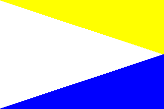
image by Ivan Sache, 16 January 2009
"Colegio 'Ismael Perdomo'" was founded in 1954 in
Bogotá. The institute was named in 1960 after Ismael Perdomo
(1872-1950), Archbishop of Bogotá (1928-1950).
The flag of the institute, as shown graphically on the website of
the institute, is made of three yellow,white, and blue triangles.
Ivan Sache, 16 January 2009

image by Ivan Sache, 16 December 2008
"Universitaria de Investigación y Desarrollo" (UDI)
was founded in Bucaramanga in 1982 as "Centre Superior de
Sistemas - Centrosistemas" by a group of engineers from the
University of Santander led by Jairo Castro Castro. The institute
was recognized as "Corporación Universitaria
Centrosistemas" by the Ministry of National Education on 1
August 2002 (Decree No. 1856); its name was changed to UDI on 11
April 2003 (Decree No. 731).
UDI has now four campuses located in Bucramanaga,
Barrancabermeja, San Gil and Valledupar.
The flag of UDI is shown graphically and described on the UDI
website. The flag, designed by Marisol Barragán, student in
graphic design, is in proportions 1:2, blue with an orange square
in the upper right corner, covering one-third of the flag height
and an orange rectangle of the same width, covering two-thirds of
the flag height, adjacent to the square.
The flag was designed after the logo of UDI, designed by Carlos
Andrés Pérez, graduate in technology and graphic
design, in which the blue "I" is surmonted
by an orange square dot; on the flag, the orange elements match
this pattern. Moreover, they are expected to represent
the move and progress ofthe institute.
Blue represents tranquillity without excitement, like the pulse
and the pressure blood. Psychologically, blue represents a state
of peace and satisfaction, as the colour of introversion. Orange
is the colour of enthousiasm and interest for everything. The
square means honesty, rectitude, care, balance and stability.
Ivan Sache, 16 December 2008
image by Ivan Sache, 29 March 2009
"Gimnasio Iragua" (lit., "The Forge"), was
founded in 1968 at Bogóta by ASPAEN ("Asociación para la
Enseńenza), the organization set up in Colombia by the Opus Dei
movement. Classes started on 20 January 1969. The name of the
institute is explained as follows on the website of the
institute:
"Iragua is a word that comes from the Chibcha language and
means river bed. This supposes a dynamic that flows from an
origin to an end, through which liberty is practiced within the
limits of responsibility to follow the natural law of being a
more perfect human person."
The flag of the institute, as shown graphically on the website of the
institute, is horizontally divided white-green-red.
White stands for purity
Green stands for hope and truth.
Red stands for love.
Ivan Sache, 29 March 2009