
Last modified: 2009-08-08 by dov gutterman
Keywords: education |
Links: FOTW homepage |
search |
disclaimer and copyright |
write us |
mirrors
See Also:
"Instituci¾n Educativa 'Ram¾n Giraldo Ceballos'"
was founded in MedellĒn in 2002 (Decree No. 16,386), as the
merging of "Escuela Urbana de Varones 'Ram¾n Giraldo
Ceballos'" and "Escuela Urbana de Ni±as 'Ram¾n
Giraldo Ceballos'", both founded on 30 December 1968 (Decree
No. 033) on plots offerred by Ram¾n Giraldo Ceballos.
The flag of the institute is described on the website
of the institute as made of two white and blue stripes of
equal size and a handshake.
White represents purity, peace and love, the values promoted by
the institute.
Blue represents the greatness of the mind in search of God.
The handshake represents solidarity, fraternity, help,
cooperation and friendship.
Ivan Sache, 12 January 2009

image by Ivan Sache, 17 December 2008
"Corporaci¾n Universitaria Remington" was founded
in MedellĒn in 1915 by Gustavo Vßsquez Betancourt (d. 1967), as
"Organizaci¾n Educativa Remington". The university was
approved by the Ministry of National Education on 21 June 1996
(Decree No. 2661).
The flag of the university, as shown graphically on the university
website, is vertically divided blue-red with the university
emblem in the middle, reaching the horizontal edges of the flag.
The seal-shaped emblem of the university shows a white
"R" for "Remington" and the foundation year,
1915, on a background filled with two basic, opposed colours. Red
represents the warm passion required to teach and learn while
blue represents the cold reason required for knowledge. The rim
of the seal is white, a neutral colour, bearing the motto of the
university, "Poder estudiar, poder trabajar" ("To
study, to work"), and two fleurs-de-lis representing the
historic victory of knowledge.
Ivan Sache, 17 December 2008
"Colegio 'Restrepo Millßn'" was created in Bogotß
by National Decree No. 2940 on 24 November 1961 and approved by
the Ministry of National Education on 24 November 1962 (Decree
No. 4738); classes had already started on 5 April 1962. The
institute is named after the noted educator Josķ MarĒa Restrepo
Millßn (1894-1955).
The flag of the
institute, according to a photo shown on the website
of the institute, is horizontally divided white-green with
the emblem of the institute in the middle.
The symbols shown on PDF
files available on the website of the institute are quite
different: - the flag
is horizontally divided green-white, without the emblem; - the
emblem seems to have different colours, for instance blue instead
of green in its upper part.
Ivan Sache, 27 January 2009
"Colegio Cooperativo 'Reyes Patria'" was founded by
priests of Sogamoso, Department of Boyacß, with permission of
the Bishop of Duitama, His Grace Julio Franco Arango, granted on
21 December 1965. The institute is named after General Juan Josķ
Reyes Patria, who took part to the War of the Supremes
(1839-1841), a rebellion of military regional leaders,
self-styled supreme heads, against President of the Republic of
the New Granada Josķ Ignacio de Mßrquez.
The flag of the
institute, according to a photo and the description available on
the website
of the institute, is white and apple green with the emblem of
the institute in the middle. The exact arrangement of the two
colours cannot be ascertained from the photo.
White represents peace as well as individual and social harmony,
while apple green represents the kindness of the cooperative
sector.
The emblem of the institute represents its philosophy, focused on
education through knowledge and increase of its values, always
supported by the cooperative spirit.
Ivan Sache, 12 January 2009
"Instituci¾n Educativa Rioloro" was founded in 1926
in Rioloro, Municipality of Gigante, Department of Huila.
The flag of the
institute, as shown graphically and described on the blog
of the institute, is horizontally divided blue-white-green.
The respective proportions of the stripes cannot be derived
accurately from the drawing.
Blue represents knowledge.
White represents honesty, transparency, joy and peace.
Green is a tribute to work, to the creative power of letters, art
and land cultivation, and to hope in a better future.
Ivan Sache, 4 February 2009
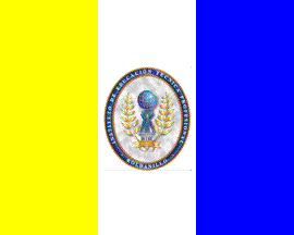
image by Ivan Sache, 19 December 2008
"Instituto de Educaci¾n Tķcnica Profesional de
Roldanillo" (INTEP) was created on 17 May 1979 (Decree No.
1093) in Roldanillo as "Instituto de Educaci¾n
Intermedia Profesional de Roldanillo". The institute was
reorganized and renamed "Instituto de Educaci¾n Tķcnica
Profesional de Roldanillo" on 26 April 1988 (Decree No. 758)
and its general statutes were approved by the Ministry of
National Education on 15 May 1989 (Decree No. 1027).
The flag of INTEP is shown graphically and described on the INTEP website.
The flag is vertically divided yellow-white-blue with the emblem
of INTEP in the middle, in dimensions 1.20 m x 1.50 m (that is,
with proportions 4:5).
Yellow is the colour of the nobleness and high value of
knowledge, and of the joy and honour characterizing all the
working activities in the institute.
White is the colour of light and the greatest symbol of union,
purity and nobleness confered by study.
Blue is the colour of the sky over Roldanillo, and, more
generally the colour of heavens once clouds have dispersed; it
represents truth, justice, the deep gentleness of the university
members and loyalty to the spiritual values.
Placed on the symbolically strong white colour, the emblem of
INTEP unites the meanings of the yellow and blue colours.
The vertical display of the colours represent the continuous
increase of knowledge towards excellence. It also expresses the
infinite and the possible movement. The colours are arranged to
match the physiologic mechanism of visual perception.
Yellow, a warm colour, is placed in the left visual field and is
interpreted by the brain right hemisphere, in relation to
sensibility, imagniation, intuition and creativity.
Blue, a cold colour, is placed in the right visual field and is
interpreted by the brain left hemisphere, in relation to
intelligence, rationality, science and language.
The vertical stripes are arranged according to an horizontal
gradient of colour temperature, from the warm yellow to the cold
blue, mitigated by the quite cold and still white. This colour
display is harmonic and balanced, both in time and space.
The emblem of INTEP is made of a shield surrounded by an elliptic
border.
The elliptic border is ornamental but mandatory, with a ratio of
6:5 between its greater and smaller axes. It represents the
trajectory of a celeste body moving around another on
an orbit prescribed by the Law of universal gravitation.
In the lower focus of the elliptic shield is placed the shaft and
capital of a Doric column. The lower part of the shaft is charged
with a scroll bearing the motto ot INTEP and its Latin
translation. A woman and a man stand on the column, rising their
arms to support the globe placed in the upper focus of the
ellipse. The column symbolizes the support and cohesion provided
by the past and shared traditions to people, represented by a
pair in a creative function, aimed at the free research of inner
and outer knowledge.
The central elements are surrounded by two golden branches of
olive symbolizing peace and the commitment of INTEP to keep and
preserve the natural environment with the help of science and
progress.
Yellow, used in the outline of the outer ellipse, in the olive
branches and in the scroll, represents the sun as a source of
vitality, loyalty to the commitments, the nobleness and high
value of knowledge, and the joy and honour characterizing all the
working activities in the institute.
Blue, used in the central figures, in the globe and the column,
is the colour of the sky over Roldanillo, and, more generally the
colour of heavens once clouds have dispersed; it represents
truth, justice, the deep gentleness of the university members and
loyalty to the spiritual values.
The motto is written on the scroll in relief, with letters
outlined in black, representing prudence, shyness and honesty.
The background of the shield is white, the colour of light and
the greatest symbol of union, purity and nobleness confered by
study.
Ivan Sache, 19 December 2008
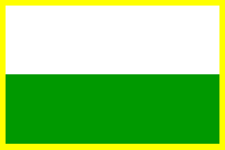
image by Ivan Sache, 8 February 2009
"Instituci¾n Educativa de Rozo" was founded in the
"corregimiento" of Rozo, Municipality of Palmira,
Department of Valle del Cauca, on 26 September 1979 (Decree No.
1953).
The flag of the institute, as shown graphically and described on
the website
of the institute, is horizontally divided white-green with a
thin golden border all around. The drawing shows the flag tied to
a staff with a peak-shaped finial and two golden tassels.
The flag was designed by MarĒa Mabel Castillo, current Director
of the institute. Green represents the natural environment of
Rozo, agriculture as the main source of income and the aspiration
to a better future. White represents purity, peace and liberty
provided in the institute. The golden border represents God's
light guiding us every day.
Ivan Sache, 29 January 2009