image by Ivan Sache, 25 December 2002

Last modified: 2009-08-01 by dov gutterman
Keywords: education |
Links: FOTW homepage |
search |
disclaimer and copyright |
write us |
mirrors
See Also:
Other Institutions:

image by Ivan Sache, 25 December 2002
Colegio Bethlemitas is located in Medellin.
It was founded on 10 February 1947, as Colegio del Sagrade
Corazo'n de Jesu's (School of the Sacred Heart of Jesus), and
renamed Colegio Bethlemitas in 1972. The flag has a white field
with two red triangles placed in upper hoist and lower fly,
respectively, and the shield of the school placed in the middle
of the flag. Red stands for the Sacred Heart, symbol of love, and
dynamism and creativity. White stands for peace, purity and
candor.
The shield is tierced per bend. Its upper part, in chief, is
yellow with the red Sacred-Heart crowned with spines.
Yellow symbolizes the sun, the fire, nobleness and charity. Its
lower part, in point, is blue with a yellow lamp, which
symbolizes the scientific thought. Blue symbolizes justice,
gentleness, innocence and devotion. The bend bears the Latin
motto Virtus et Sapientia (Virtue and Wisdom), in blue capital
letters. Bethlemitas and Medellin are written above and below the
shield respectively, in blue capital letters. The whole is
inscribed on a grey coat.
Source: <www.bethlemitas.edu.co>
located by Dov Gutterman .
Ivan Sache, 25 December 2002
"Colegio Bilingüe Beth Shalom" was founded in 2000
in Bucaramanga by Pastors Carlos Orlando Anaya and Emperatriz
Arenas de Anaya, founding members of the "Iglesia Comunidad
Cristiana de Fe y Restauración" in 1986. The name of the
institute, "Beth Shalom", means "The House of
Peace" in Hebrew.
The flag of the institute,
as shown graphically and described on the website of
the institute, is vertically divided blue-red-blue, with thin
white stripes separating the fields, and the emblem of the
institute in canton.
Blue represents depth, knowledge and intelligence, as well as
seriousness, safety, confidence, harmony and friendship. It is
the colour of God.
Red represents love and passion, as well as vitality, joy and
dynamism. It is the colour of the sacrified blood of Jesus.
White represents purity, health and transparency. It is the
colour of the Holy Spirit.
The emblem of the institute is made of a white shield charged
with five curved stripes of four different colours representing
the values of the institute, love (red), service (blue), truth
(green), justice and transparency (yellow). The colours also
recall the flags of Colombia and Bucaramanga. Upon the lower
right part of the shield is placed the circular emblem of the
"Iglesia Comunidad Cristiana de Fe y Restauración",
patron of the institute. Upon the upper left part of the shield
is placed another circular emblem, white with a schematic, red
representation of a student and an open book.
Ivan Sache, 10 January 2009

image by Ivan Sache, 28 December 2008
Flag of UPB is based on <www.upb.edu.co>.
Dov Gutterman, 3 June 2001
"Universidad Pontificiana Bolivariana" (UPB) is a
Roman Catholic institute, recognized "ab homine" by the
Archbishop of Medellín Tiberio de J. Salazar y Herrera on 15
September 1936, and subsequently recognized by the Government of
Colombia on 22 February 1937 (Decree No. 48). The university was
upgraded to a "Pontificia" by the Holy Congregation of
Seminaries and Universities on 16 August 1945. UPB has its main
seat in Medellín and secondary seats in Bucaramanga, Montería
and Palmira.
The flag of UPB, as shown graphically and described on the UPB
website, is horizontally divided red-black with the emblem of
UPB in the middle.
Red represents charity while black represents science and
modesty. The flagstaff shall have a flame-shaped finial, with the
same meaning as the shield.
The flag shall be used in all the official and academic events.
The shield of UPB, designed by Enrique Cerezao, is made of a
black shield with a yellow border, charged with the Greek capital
letters "Alpha" and "Omega", a flame, the
letters "UPB", all in yellow, placed on a red and
yellow "Cross of the Knights of
Portugal", indeed a Cross of Christ.
"Alpha" and "Omega", as the first and last
letters of the Greek alphabet, represent God as the beginning and
the end of anything. The flame is the Christian symbol of
science. Yellow represents faith, purity and constancy. The
meaning of red and black is the same as on the flag.
"Manual
de Imagen Corporativa UPB", released in 2005, gives a
very detailed construction sheet of the shield (p. 26) and
recommends the following shades (pp. 21 and 59):
Red: CMYK 0 100 100 0 - RGB 255 0 0 - Pantone 1795c
Gold: CMYK 0 20 100 0 - RGB 255 204 0 - Pantone 116c
Black: CMYK 0 0 0 100 - RGB 0 0 0 - Pantone Process black.
Ivan Sache, 28 December 2008
Former, probably unofficial, flag of UPB

image by Ivan Sache, 3 June 2001

image by Carlos Thompson, 28 May 2003
Translated from Universidad del Bosque (Bogota)
website at <www.unbosque.edu.co>:
"Using several schemas used for sumarizing a few of the
program ideas, the flag was designed. A rectangle which two
oblique lines divide in three triangles: the upper and the lower
are rectangle (triangles) and in the middle another triangles
that is openning till it reache the bass and continues to the
infinity meaning the raising complexity of our studies, the
progressive increment of our knowledge that never ends. The
upper in orange color, the color of medicine, the lower in green
color symbol of hope, and the central white, sign of clean and
purity and in it the symbol".
Carlos Thompson, 28 May 2003
"Escuela Colombiana de Medicina" was recognized by
the Ministry of National Education on 4 August 1978 (Decree No.
11153) on the grounds of "Clínica El Bosque".
The institute was upgraded to a university by the Ministry of
National Education on 5 February 1997 (Decree No. 327).
The symbol of the university, shown on the right part of the
flag, was adopted in 1982. It is based on a Muisca artefact kept
in the Gold Museum of the National Bank as item No. 1990. Found
in Soacha and 15- cm high, the item represents a mace and two
snakes, probably belonging to a lord or a shaman. The artefact is
shown in the book by Antonio Grass, "Diseńo precolombino
colombiano" (Bogotá, 1972).
Ivan Sache, 30 December 2008

image by Dov Gutterman, 21 July 2002
Image based on <www.uniboyaca.edu.co>.
Dov Gutterman, 21 July 2002
The flag of Uniboyacá, as shown graphically and described on
the university's
website, is horizontally divided white-red-white. White
represents the spiritual world, including research, science,
education and all kinds of intellectual work. It represents also
the youth.
Red represents life in its permanent evolution and improvement,
the vital sap of our history and the symbol of our liberty.
The colours of the flag of Uniboyacá are the core of the flag of
the Department of Boyacá.
Ivan Sache, 27 December 2008

image by Ivan Sache, 18 January 2009
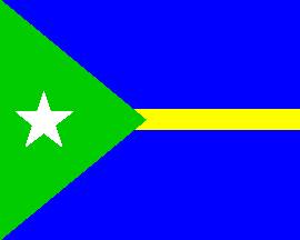
"Centro Educativo Distrital Britalia" is located in
the borough of Britalia, Bogotá.
The flag of the institute, as shown graphically on the website of the
institute, is blue with a thin yellow stripe in the middle
and a green triangle charged with a white star placed along the
hoist.
Ivan Sache, 18 January 2009