Last modified: 2007-04-14 by antónio martins
Keywords: santa casa da misericórdia de lisboa | miza | coat of arms: escutcheons | skull | cross: latin (golden) | crown | wreath | anmp | maps | movimento de apoio à problemática da sida | e | expo ’98 |
Links: FOTW homepage |
search |
disclaimer and copyright |
write us |
mirrors

Here, in Portugal, the vast majority of municipalities have come together
and created an association to defend the interests of local powers in talks
with the central administration. The association is called
Associação Nacional dos Municípios Portugueses (National
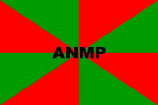
Association of Portuguese Municipalities), and has a flag. Since many of our
municipal flags have a gironny pattern, what better
flag for the A.N.M.P. than a gironny of red and
green?.
Jorge Candeias, 03 Oct 1997
A national association that joins together all the portuguese
municipalities, working a bit as a lobby of local government in dealing with
the central power. It is, therefore, a rather relevant organization in the
portuguese political scene. Recently new observations (TV and still pictures
in online and off-line media) have led me to the conclusion that either my
original report (without lettering) was incomplete and my observations flawed,
or that it represents a rather marginal use of the flag. It so happens that in
all my recent sightings of this flag, besides the green and red gyronny
background (rather adequate for this organization) there is also a sigla, in
black bold letters, centered in the field.
Jorge Candeias, 26 Jan 2004

The flag is seen more often as small and square table flags, in
conferences and such, but the sighting of the rectangular variant is
also frequent, either flying outside or as interior flags.
Jorge Candeias, 26 Jan 2004

The Lisbon Holy House of Mercy (Santa Casa da Misericordia de
Lisboa), created in the last century with the main objective to provide
help to the poor, as a charity organization, with strong connections with the
Church. It’s not the only Holy House of Mercy that exists in Portugal,
there are quite a few more, but it’s by far the richest and the better
known. I don’t really know much of it’s history and legal status,
but I do know that it has had the responsability of managing the profits of
most of the legal gambling (lotteries, lottos a.s.o.). It has a very complex
arms and a flag, the arms on a white background. The arms consists of a golden
scroll reading "MISERICÓRDIA / DE LISBOA" in black
capitals, a few green branches that hold two tilted and symmetrical to each
other oval sields, one being an oval depiction of the
portuguese traditional arms, and the other one
containing a white skull and crossbones below a golden cross and the letters
"MIZA". The whole thing is topped by a 5-stemmed crown.
Jorge Candeias, 03 Oct 1997

I have mentioned to the list several times before Expo’98, an international exhibition that will take place in Lisbon next year. It will be a thematic event under the theme «The oceans — a heritage for the future». More than 100 countries and organizations will be there, so it will be a major event.
Like other similar events, Expo’98 has a flag of its own. It is, of course, just a logo-on-bedsheet flag, but, since the logo is in my humble opinion a particularly beautiful one, I like the flag quite a lot. The flag is white, with the logo in its superior 2/3 and "EXPO’98" below in dark blue. Above and towards the right, appears the word "LISBOA" in smaller font, also in dark blue.
The logo is basically a blue ellipse raised to the right with white wavy lines that compose the character "E", representing the oceans and their waves, with the "E" for the expo itself. Near the leftmost zone of the “oceanic” ellipse, a yellow semicircle represents the rising sun.
Jorge Candeias, 15 Oct 1997

MAPS is a portuguese AIDS-related NGO (non-governmental organization), and the sigla means "Movimento de Apoio à Problemática da SIDA", that is "Movement for Support of AIDS Problematics", or something of the sort. It made a 2-day congress in my town not long ago, and I could spot their flag there.
It’s one of the most typical of the most typical LOBs: white with logo. But it’s even worse than ordinary LOBs not only because the logo ain’t that good in itself (a couple of scrawls based on the AIDS campaign ribbons in weird colours — orange and a sort of greenish brown or grey —, the sigla in black and the full name also in black) but because it’s disposed strangely, slightly curving upwards to the right (note: to the right, not to the fly — I guess this thing is not mirrored in the reverse, though I can’t say ’cause only the obverse was visible), making the whole look quite unstable and unbalanced.
Jorge Candeias, 26 Mar 1998

Clube Naturista do Centro (Naturist Club of the Centre [of Portugal]) «follows naturism by the practice of communal nudity, to improve a more healthful and harmonious life, with respect for each other and for Nature». Their flag is self-explanatory. Francisco Santos, 27 May 2003
Anything below this line was not added by the editor of this page.