image by Željko Heimer, 27 June 2004

Last modified: 2010-01-30 by dov gutterman
Keywords: istria | rasa |
Links: FOTW homepage |
search |
disclaimer and copyright |
write us |
mirrors

image by Željko Heimer, 27 June 2004
See also:
Other sites:
Raša (Ras<a) is a community in the Istria County.
Population about 4,000, some 2,000 in the small town of the same
name. It is situated about, half way between Rijeka and Pula,
some 30 km northeast of Pula. Raša is often nicknamed the
youngest city in Istria, it was built in 1937 as miners'
settlement, and mining is still the most important industry
there. The symbols were adopted some time in November 2003,
according an article in a local newspaper: Kristian Stepcic
Reisman: "Opcina Raša dobila novi grb - Rudarska
svjetiljka kao putokaz za bolju buducnost", "Ca je
novega?" besplatni informativni list, br. 3/03, Holcim,
Raša, prosinac 2003, available on line at <www.holcim.com>.
It was designed (as it is obvious by the style) by the Rijeka
company Heraldik-art d.o.o.
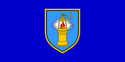
The Coat of Arms of Raša is Azure a
miner's lamp or inflamed gules iradiating argent. The flag is
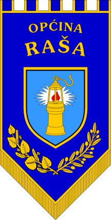
dark-blue with the coat of arms bordered yellow. Ratio 1:2. The Ceremonial Flag is a blue gonfalon with
triangular fly ending with golden fringe, containing the yellow
bordered coat of arms in the middle, the name of the community
above and linden and olive branches below.
Željko Heimer,27 June 2004
Coat of Arms and flag were designed by Heraldic Art d.o.o from
Rijeka and approved by the Ministry of Administration/Central
State Office for Administration before 2006.
Željko Heimer, 23 May 2008
There is an minor difference between the Coat of Arms shown in
the above mentioned magazine (showing also pictures the drawings
prepared by the designer) and obviously used by the community
(see: <www.rasa.hr>
) and the variant shown in the poster by the designer
("Likovna rješenja službenih grbova odobrena od
Ministarstva uprave a na temelju pozitivne ocjene od Povjerenstva
za odobrenje grba i zastave", poster, 4 str, Heraldic art
d.o.o. Rijeka (2006.), see: Coat of Arms at the
Designer's poster), presumably showing the official designs.
Anyway, the variant of depiction shows differences in two
particular points that are most obvious - the shape of the red
flag and the shape of the burner (if that is the name of that
part of the lamp) from which it emerges. Namely, in the official
design (i.e. the one from the magazine and shown on the web site)
the flame top is off centred to sinister, i.e. the flame is not
symmetrical along the vertical, while in the poster depiction the
flame is symmetrical and the top is not visible behind the
central bar of the lamp. The burner part in the official design
has obvious notch in the dexter half from which the flame is
burning, while the burner in the poster design is a bit higher
and has no notches.
Željko Heimer, 24 August 2008
A photo of the mayor in front of the flags is available of the
main page of the community web site.
Željko Heimer, 5 September 2009

image by Željko Heimer, 27 June 2004
pn-rs.gif)
image by Željko Heimer, 27 June 2004
pn!rs.gif)
image by Željko Heimer, 24 August 2008