
Last modified: 2010-02-06 by dov gutterman
Keywords: guatemala | quiche | quetzal | pyramid | el quiche |
Links: FOTW homepage |
search |
disclaimer and copyright |
write us |
mirrors
See also:
Municipalities:
Other sites:
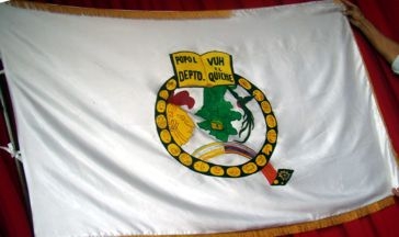
Here is photo of the flag
was taken on October 13th, 2009 during a public act in the
municipality of Santa Cruz del Quiché.
In 1972 the local artist Manuel Emérito Ramos created a new
badge for the Department of Quiché. The design was accepted on
September 12, 1972 by a local high level committee, and meanwhile
put locally in practice. On national level the department still
is represented in publications and newspapers often by the arms
of their capital city Santa Cruz del
Quiché.
The symbolism of the design comes mainly from the Mayan heritage
(the Ki’ches are the biggest Mayan people in Guatemala):
- The black circle with his leg means the Q for Quiché and
contains 18 hiroglyphs, which represented the, then, 18
municipalities (in 2009 - 21 municipalities).
- The foot of the Q is a typical woven and bordered artwork and
represents the traditional textiles
- In the centre appears a map of the Department in
green for the rich nature and with the municipal limits, inside
the map is a small picture of the Mayan temple Tohil
- On the right hand appears the national indigenous hero Tecún
Umán, a brave defender against the Spaniards, and on the left
side the national bird Quetzal
- The crown serves the holy book Popol Vuh, the only completely
surviving Mayan literature.
The flag is a white cloth in the proportion of 5:8 with the arms
in the center and with a golden border fimbration. The white
stands for purity, peace, integrity and steadfastness.
Source: Victor Núńez Anléu “Escudo del
departamento de Quiché”, en El Quiché al día, ańo 1, No
IV, 2007.
Rudolf Wasem, 17 October 2009
qc.gif)
image by Jaume Ollé
Here is another image (contributed by Rudolf Wasem, 17 October 2009)
qc1.jpg)