by Pascal Gross

Last modified: 2008-02-03 by phil nelson
Keywords: toronto | ontario |
Links: FOTW homepage |
search |
disclaimer and copyright |
write us |
mirrors
See also:
External links
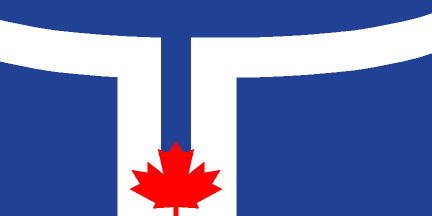
The white band is supposed to resemble a T for the city's name, but also recalls the appearance of the City Hall building. The flag was adopted on the 140th anniversary of Toronto in 1974.
I got this information from Kevin Harrington's article "Seven Cities in Search
of a Flag" published in the Communications of the XI International Congress of
Vexillology (Madrid, 1985). The City of Toronto is one of the seven administrative
units making up Toronto. The others are Metropolitan Toronto (covering the whole
of the city - the City of Toronto is only the city centre) and the cities of East
York, Etobicoke, North York, Scarborough and York. All of them have flags.
Jan Oskar Engene
I have just returned from Toronto, and as always on a trip seem to find unusual flags or flag combinations. I searched for an answer to Luc Baronian's question: "Any news on the new Toronto flag ? Is it the former city flag, the former metropolitan flag or a completely new one ?" and in one place did see the Toronto flag as reported above (I attach a coloured version of it - however I saw it from a bus, and cannot vouch for dimensions, angles, etc.)
At Toronto City Hall, where I expected to see this flag, there is a nice display
of the parade of provinces - done as two circles of flagpoles with the Canadian
flag in the centre of each. However, the flag that had the "pride of place" was
a most unexpected flag - a green-white-red horizontal tricolour, flying on a low
roof above (and slightly behind) the two circles of Canadian and provincial flags
(and from the viewer's point of view, clearly flying "over" the other flags).1
As far as I can tell it was the patriots' flag of Quebec (an independentiste group),
ratio clearly 1:2 ! I am very curious as to why Toronto city hall would fly that
flag!
Rob Raeside - 28 October 1998
1 This flagpole most often flies the Canadian flag. However,
being a multicultural city, the City Protocol allows the raising of various
other flags. Most of these are national flags of the various ethnic communities
living in Toronto. The one your contributor most likely saw was the Hungarian
flag. In addition to national flags, the rainbow flag of the gay community flies
during Gay Pride Week, and other subnational flags may also be raised. It is
said that these flag raisings are to publicise particular events in the city,
and are typically short-lived. Between these, it is the Canadian Maple Leaf
that flies on this pole.
Aleksandar Ilievski, 25 March 2005
Council committee picks Toronto's 25-year-old design
By Bruce DeMara
Toronto Star City Hall BureauWhat's old is new again.
After two failed attempts to adopt a new flag for the unified Toronto, city council's administration committee has chosen the flag of the former city of Toronto as the preferred design.
The flag - a blue background, a stylized white T symbolizing the two towers of Toronto City Hall and a red maple leaf - still has to be approved by city council.
In the process, councilors rejected the preferred design recommended by city staff along with a slew of others offered by graphic designers employed by the city.
That was welcome news to Rene De Santis, the winner of the former city's flag competition 25 years ago.
``I'm very happy. Twenty-five later . . . it still stands up and it's a classic design,'' said De Santis, who won the city-wide competition as a 21-year-old George Brown College student.
contributed by Phil Nelson
Two Toronto newspapers, "The National Post" and "The Torontoist", have jointly launched the Naighborhood Flags Contest "Flags for All":
"[...] we're urging our combined, talented readers to design Toronto neighbourhood flags, starting with the eclectic Kensington!".
Two flag proposals are shown on the websites of the organizing
newspapers: The National Post
and The Torontoist.
Ivan Sache, 4 October 2007
Having lots of experience with flags and flag design, I see some flaws
in the choice for Kensington. The colours would be well chosen if they
appear in darker tones; light green and light yellow however will fade
in the first sunlight that hits them. The K device is also ill-chosen -
first off all it is readable from only one side of the flag (all words
and letters on flags have this problem!) Secondly what does an 'Olde
English' style of font have to do with the market neighbourhood, apart
from the name of a street 'Kensington' of English origin. Secondly this
particular mixed font is highly suggestive of a Chinese-language
character; this would mislead. I recall in the late 1940s, when we
lived on Spadina, we didn't call it Kensington Market rather it was
known as the Jewish market. Keep, but darken, the colours because they
are representative of baked goods (gold or bright yellow) and vegetables
(greens, fruit) major market staples over many years. Substitute a bagel
for the letter K and you got it.
Kevin Harrington, 2 December 2007