![[Maple Ridge, BC]](../images/c/ca-bc-mr.gif)
image by Arnaud Leroy, 5 June 2006
Source: Maple Ridge City Hall

Last modified: 2007-08-04 by phil nelson
Keywords: british columbia | maple ridge | strawberry flowers | grass | wheel | sawmill blade |
Links: FOTW homepage |
search |
disclaimer and copyright |
write us |
mirrors
Flag per heraldic grant
![[Maple Ridge, BC]](../images/c/ca-bc-mr.gif)
image by Arnaud Leroy, 5 June 2006
Source: Maple Ridge City Hall
De Facto "Letterhead" Flag
![[Logo flag]](../images/c/ca-bc-mra.gif)
image by António Martins-Tuválkin, 9 May 2006
Arms (shield):
The line forms a "ridge" of peaks with the nearby Golden Ears mountain in the centre. The Fraser River is symbolized at the base and the namesake maple at the centre using both a broad leaf maple and flowers from the vine maple.
Crest (above the shield):
The red coronet at the base of the crest has a double meaning, as the traditional heraldic symbol for municipal government and as a salute to Haney Brick and Tile, and by extension, pioneer industry. Haney House symbolizes the pioneer settlement and Victorian beginnings of the community.
Motto:
Created by the Coat of Arms Committee from a suggestion by Mr. Peter Mussallem, the motto combines a geographic statement with comments about the nature of the District's prosperity and amenities. The phrase summarizes the core meaning of the coat of arms.
Compartment and Supports (at either side and at the base of the shield):
The grass represents the lands of the District with Kanaka Falls at the centre and the rivers below. The horse and deer were suggestions arising from the public consultation. They are coloured in pure heraldic colours to match the shield and can be taken to represent pioneer transport and current recreations (horse) and natural heritage (deer).
The strawberry flowers on the supporter's collar honour the early berry industry, the dogwood salutes B.C., the railway is represented via the wheel and forestry through the sawmill blade.
Flag:
In the classic manner of heraldry, the flag is composed of a banner divided in the same fashion as the shield but coloured opposite, gold above and blue below with a large shield of the District in the centre and a border of blue and gold at the edge reinforcing the central message of the symbolism of the shield.
Badge:
This takes one of the most important elements of the shield and adds a river
symbol. The broad leaf maple leaf and vine maple flowers are shown. On the leaf
are two narrow wavy bands of white. The whole is placed on a gold circle with a
sawtooth edge. The symbolism is of Maple Ridge, by the river and near the golden
peaks.
City of Maple Ridge,
BC
researched by Phil Nelson, 3 July, 1999
Letterhead flag
![[Logo flag]](../images/c/ca-bc-mra.gif)
image by António Martins-Tuválkin, 9 May 2007
The flag reported does not fly outside Maple Ridge's Municipal Hall. They fly a "Letterhead Logo" flag.
But requests for information get the "official flag" response.
The "Official Flag", or, if you prefer, "Heraldic Flag", does show up in pictures of the Mayor and Council, however, so I knew there was at least one "in the cloth" copy.

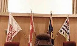
photograph by Dean McGee, 10 September 2006
On 8th September 2006, I was able to visit the council chambers and view the flags. The flags on display are (Left to Right):
These are visible at the city website behind the Mayor and Council.
The letterhead flag which flies outside reads correctly on the obverse. The one in the council chambers reads correctly on the reverse, so I wonder if it was originally the back of a two-sided flag. Older pictures of Mayor and Council displayed in the Municipal hall show:
Heraldic flag
The Heraldic flag is rather a darker shade of blue (and green) than in the official image on the coat of arms page.
The grant of arms displayed in the Council Chambers specifies that the flag is to be 3:5, but the cloth specimen seems to be 3ft x 6ft (0.9 x 1.8 m), which means that the border pieces on the fly end are slightly shorter than the ones on the top and bottom (enough to be visible).
The most curious thing about the Heraldic Flag in the Council Chambers was the writing near the Upper Hoist! Somebody "vandalized" the flag by signing his name on the flag. I couldn't read the handwriting originally, but when I uploaded the picture, I realized it was Roméo LeBlanc. LeBlanc was then the Governor General, and dated his graffito, "May 4th. 1999."
Since there may very well be only one copy of this flag in existence, the signature ought to be part of the flag, like the marks on Driver's "Old Glory", or the original "Star-Spangled Banner".
Desk flag
![[Desk flag]](../images/c/ca-bc)mr.gif)
image by António Martins-Tuválkin, 10 June 2007
The third flag is the desk flag that Maple Ridge sent me. It bears the full achievement
of arms on a white flag. No doubt a few of these desk flags were made at the time
of the grant of arms. The blue (and green) shades on this flag are also darker than
those on the Maple Ridge website.
Spirit of 2010 flag
![[Vancouver Olympics flag]](../images/c/ca@2010s.gif)
image by António MARTINS-Tuválkin, 12 June 2007
The other flag is "Spirit of 2010", which is a way of displaying an
interest in the 2010 Olympics without using the Olympic symbols. I have seen
this flag in several places. "2010" is spelled out in Blue-Yellow-Green-Red
numbers, and "Spirit of" is also in Blue (so Black is missing from this flag,
perhaps in a conscious attempt to avoid Olympic copyrights).
Dean McGee, 10 September 2006